Ranch Remodel
Architectural Design, Project Management, Owner Contracted
Prescott, Arizona
THE CHALLENGES:
Inefficient heat & A/C
Hard water
Poor hot water circulation
Odd grey water system
Inoperable windows/doors
Worn flooring throughout
No Guest Room or Family Room
A tired Kitchen
Roof and gutter replacement
Interior/exterior painting
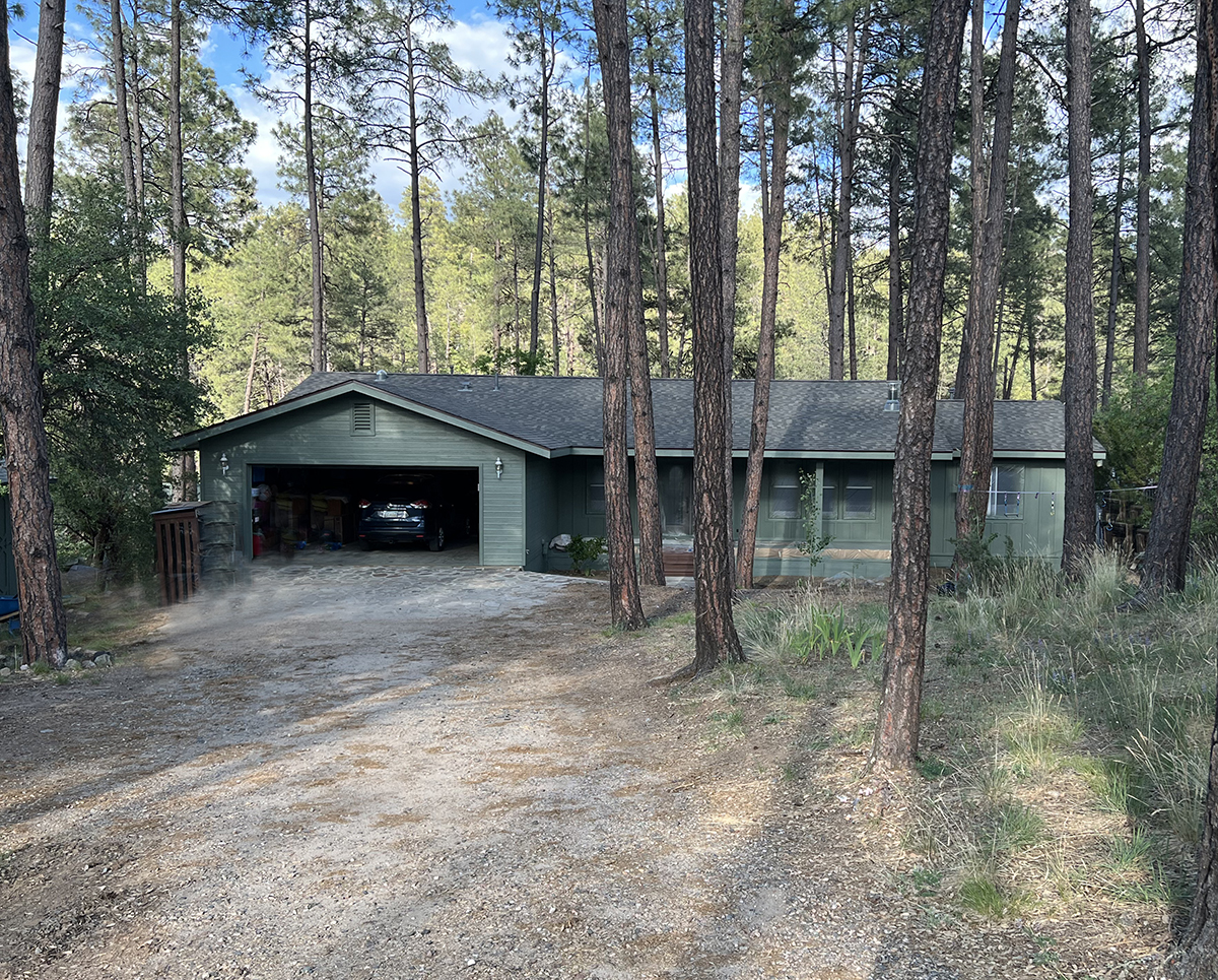
The ranch-style home in the pines of the Bradshaw Mountains of Arizona was in need of a complete renovation and update. Built by an older couple in the 1990s, it did not fit the needs of an active family of four. There was more than adequate square footage on two levels, but the layout had zero flow and the faulty mechanical systems were in dire need of replacement.
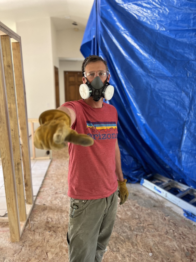
Over a period of one year, extensive work was performed in targeted areas, section by section, so the family could (mostly) remain at home and function with a minimum of disruption.
Living through a remodeling process can be challenging, and you don’t truly grasp the impact until you have lived through it.
In remodeling, it is essential to establish clear priorities from the very start.
Which conditions must be addressed? Which conditions are worth keeping?
The overall plan and budget are determined by these decisions, with the caveat that in remodeling, it is not uncommon for unexpected situations and costs to arise.
In many cases, the best option is to improve the layout, add windows and doors, and then integrate harmonious interior design choices. These adjustments are often enough to power up the spaces. This was the best path forward here in Ponderosa Park.
Use the arrows to click through the slideshows below
MAIN FLOOR DESIGN GOALS
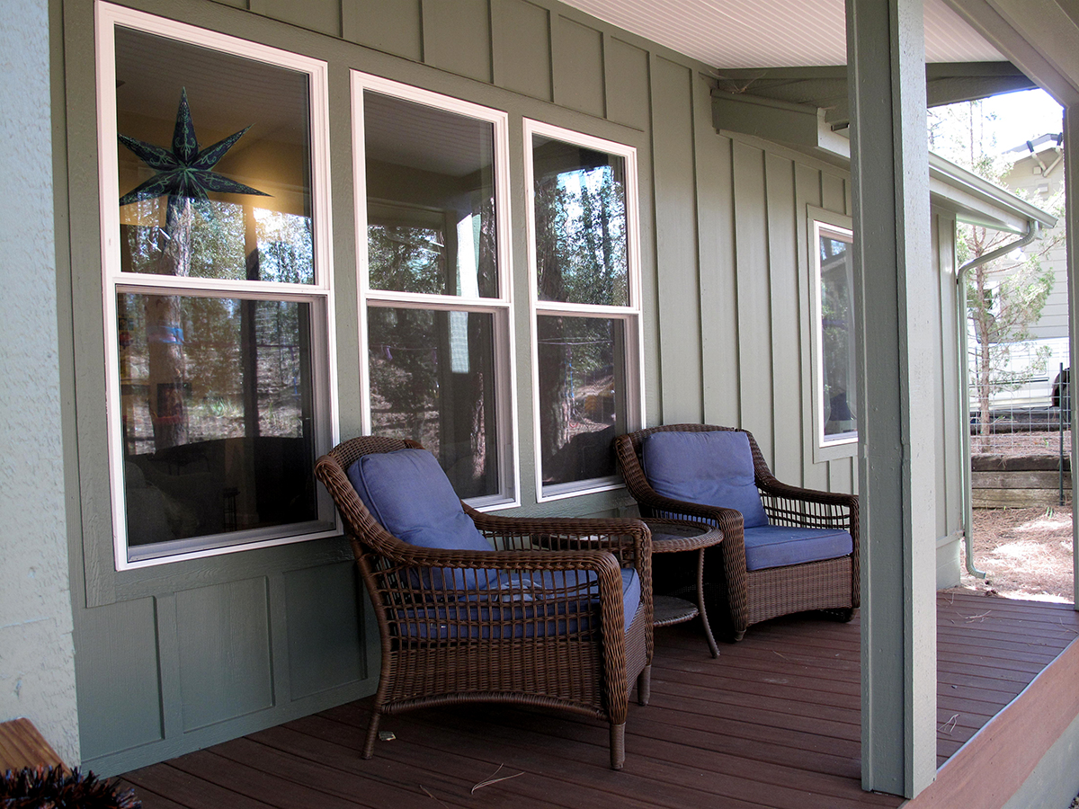
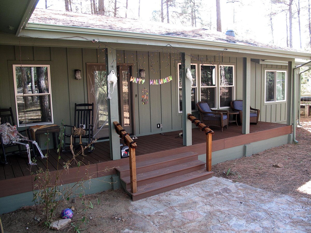
- Make the Front Porch spacious and inviting upon approach
- Upgrade the Living Room and interior entry
- Install new flooring throughout
These improvements were essential to the overall success of the project.
Originally, the interior of the Living Room had a large, dark hearth in the center of the front-facing wall. It dominated the room with no view of the pine trees out front.
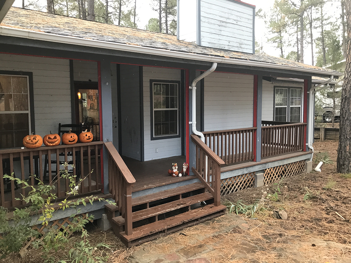
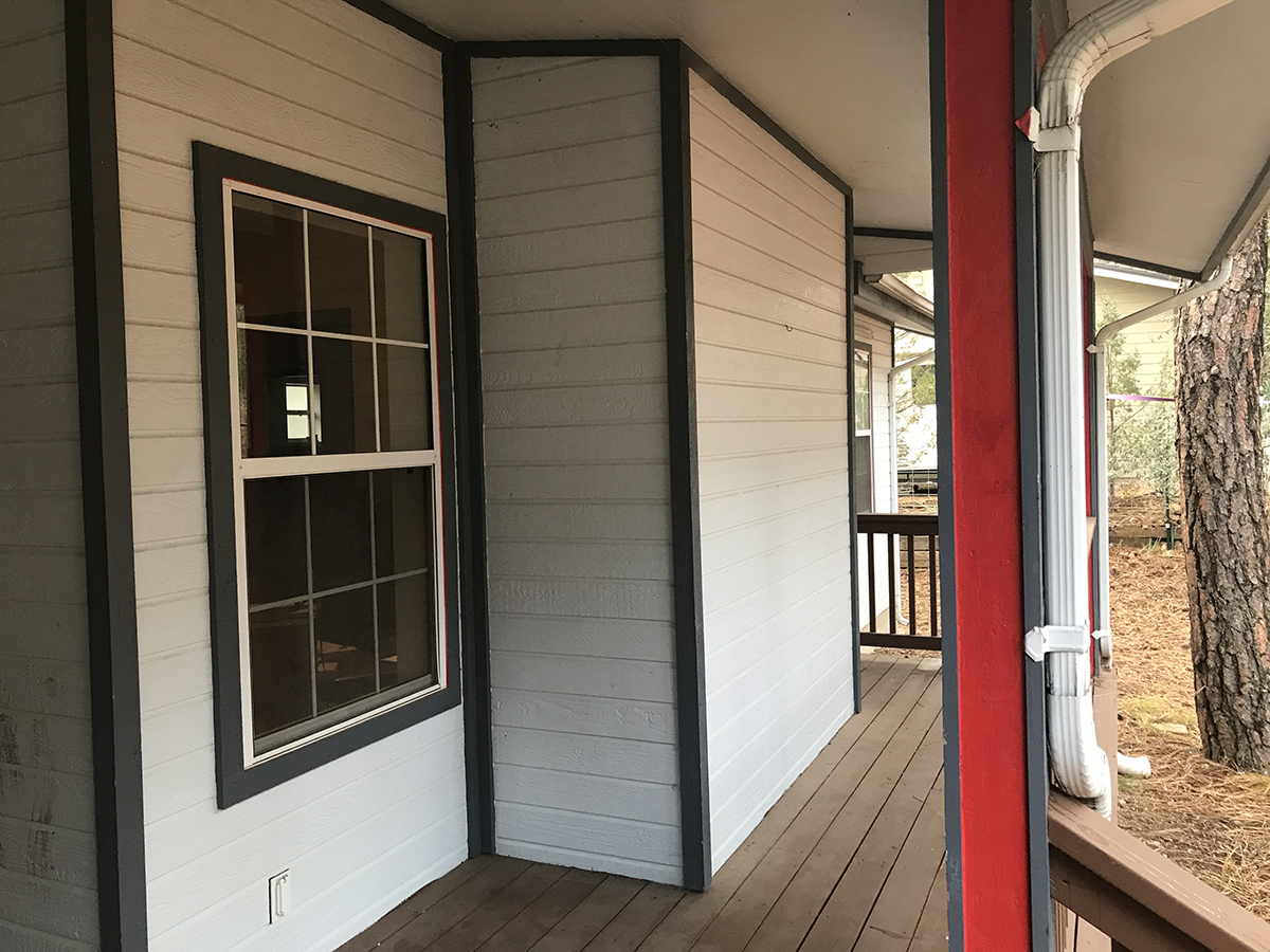
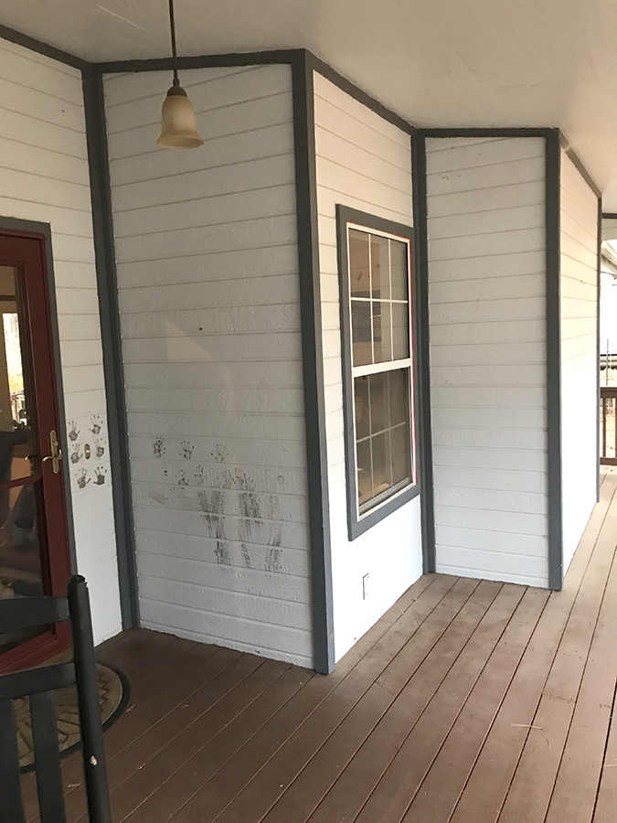
On the front porch, the large stove flue chase jutted out massively. These conditions created the feeling of a cramped space both inside and out.
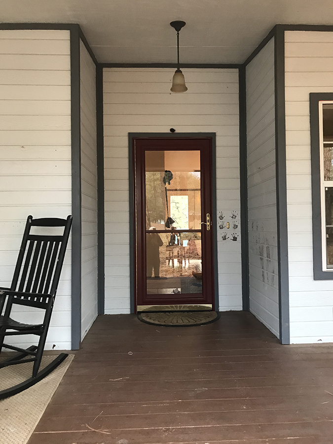
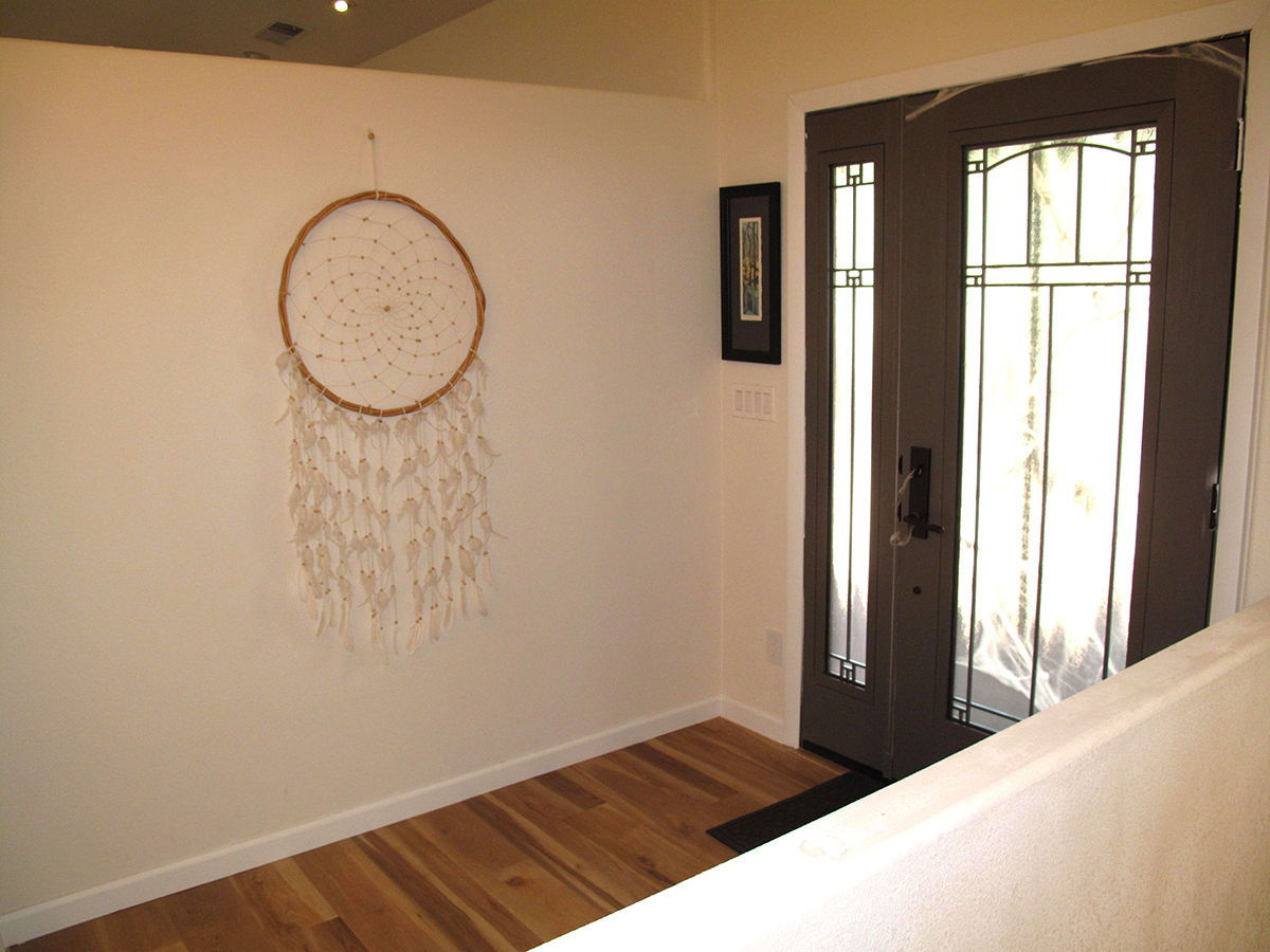
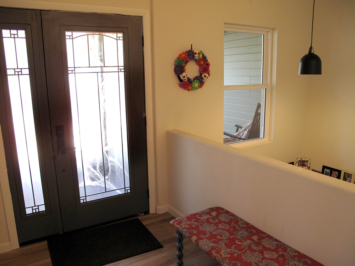
On the inside, the front door entry landed abruptly into the living area with no vestibule for guests to transition into the greater living area.
And, the tired, stained wall-to-wall carpeting had to go.
Entry Foyer Defined
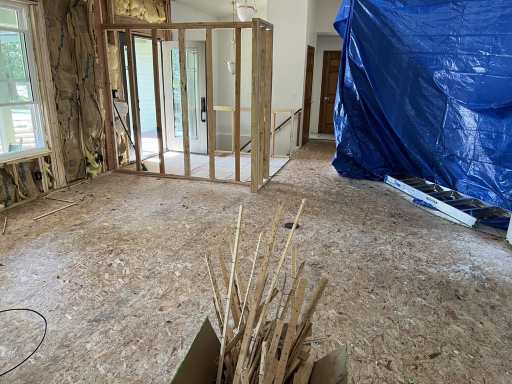
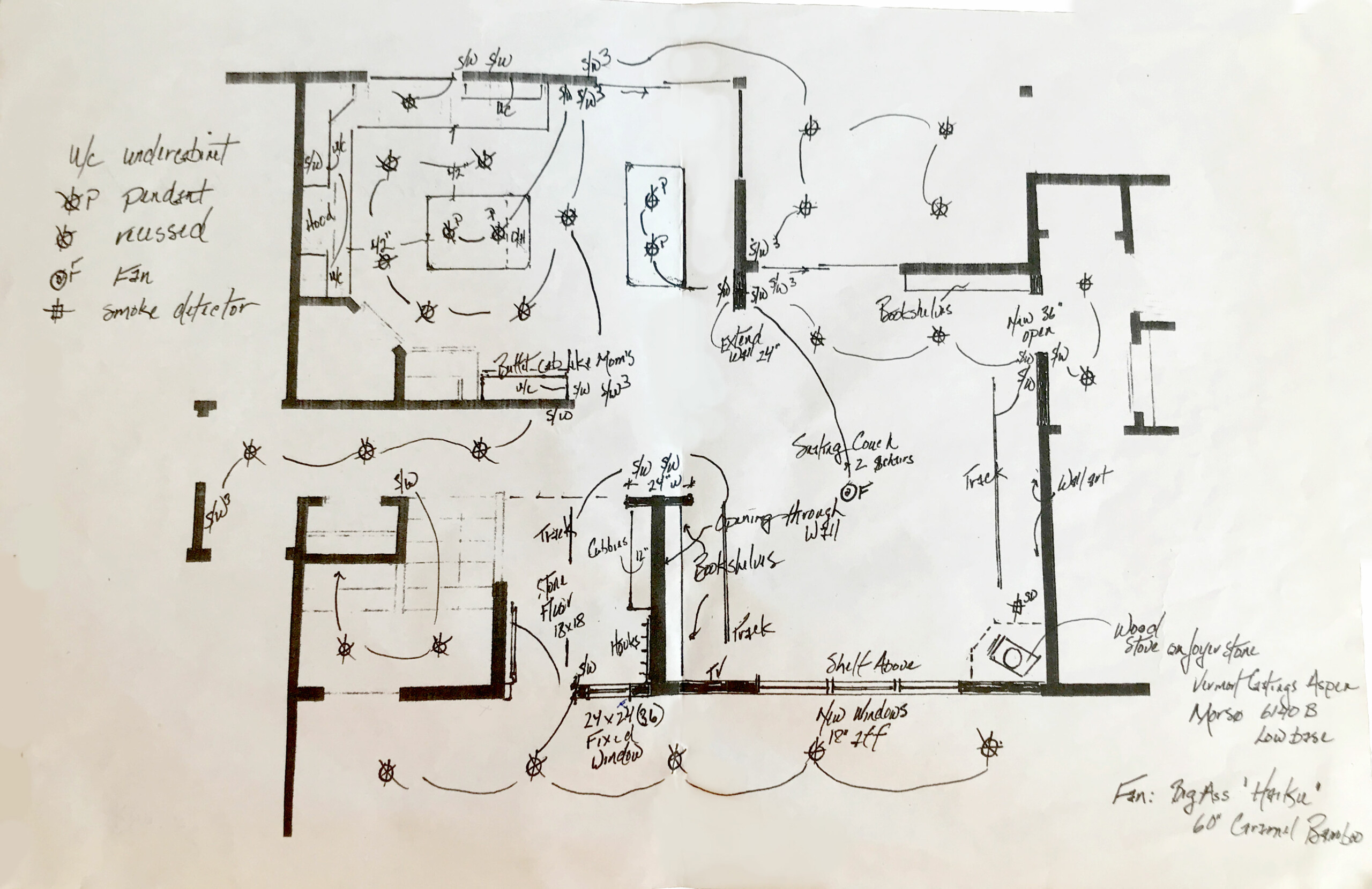
I incorporated the exterior square footage from the old entry into the interior and constructed a partition for custom built-in cubbies and shelving.
Once the built-ins are added you will remove hats, coats, and shoes before entering the home.
The partition also delineates the transition into the Living Room. While there was not quite enough square footage for a separate foyer, in the end, this solution is a vast improvement.
Living Room
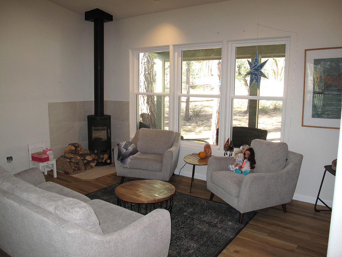
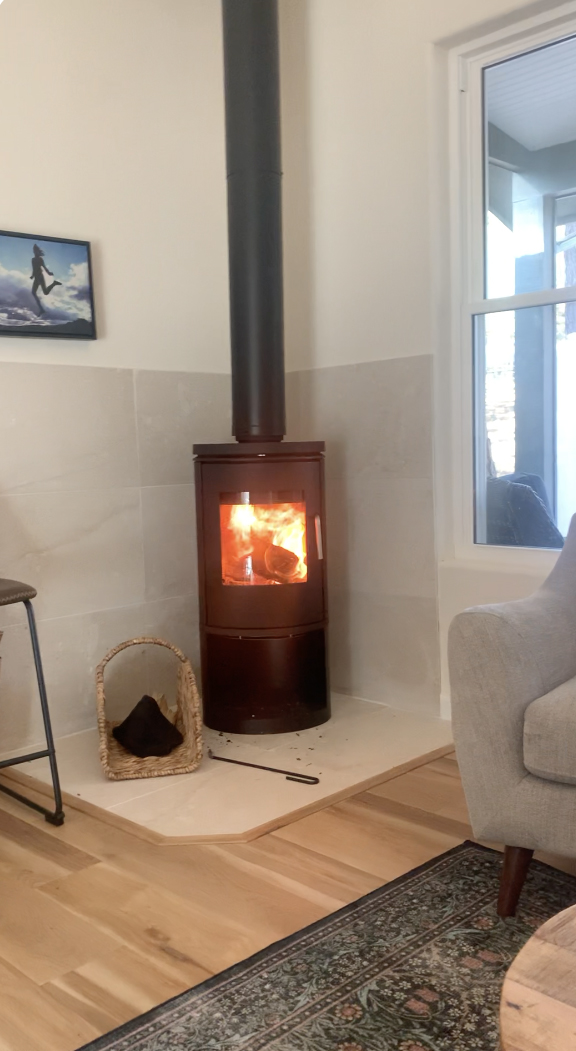
We removed the old hearth with its massive black stove and flue chase, replaced by a beautiful new triple window unit. An efficient Morso Scandinavian woodstove is nestled in the corner and makes a beautiful sculptural statement.
Now, relaxing in the living area, you can see outward through the porch to the pine woods beyond. The net gain of light and fresh air is impressive indeed!
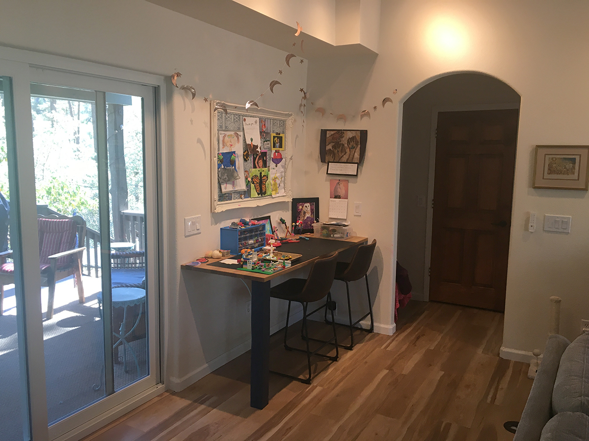
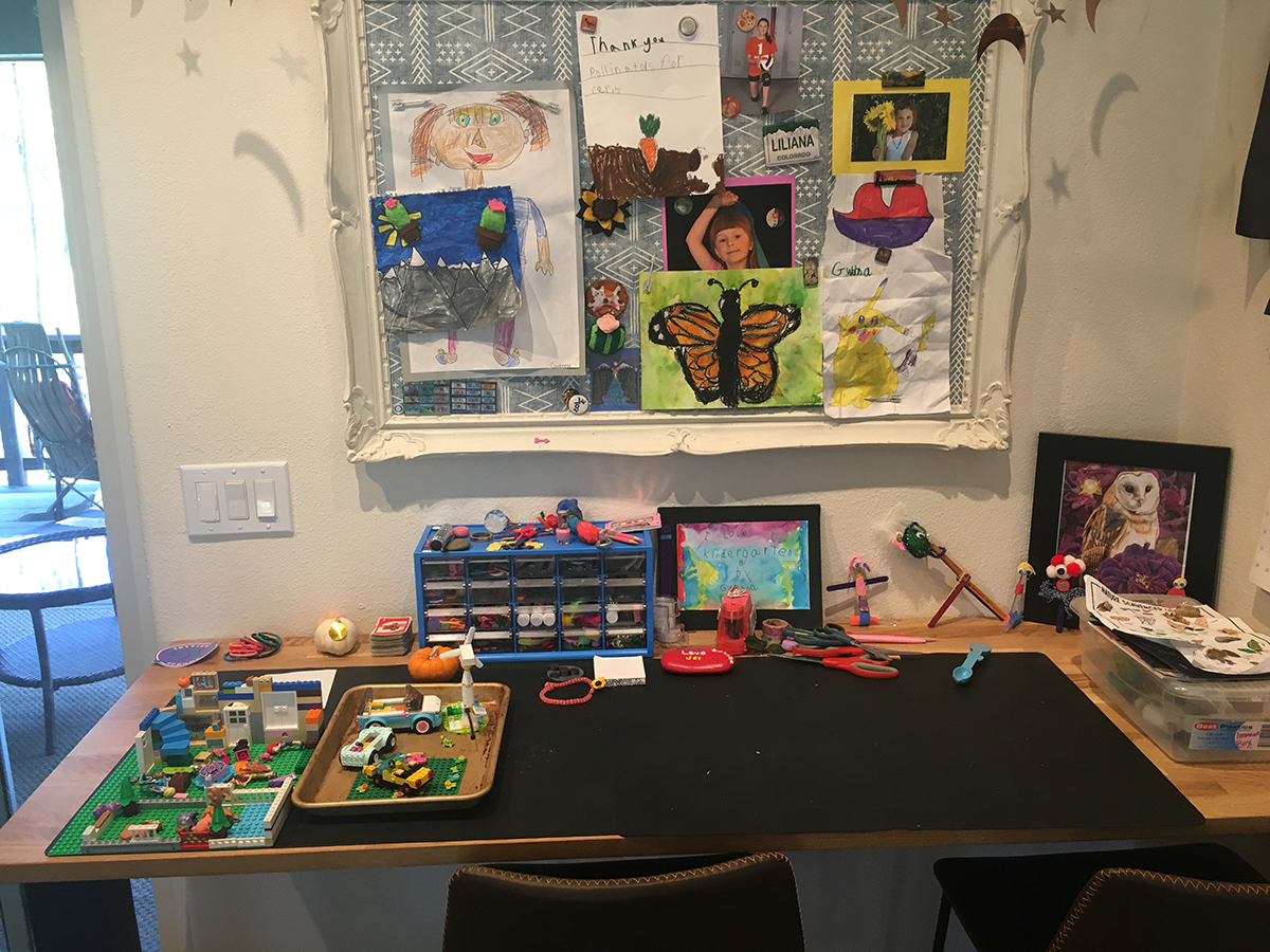
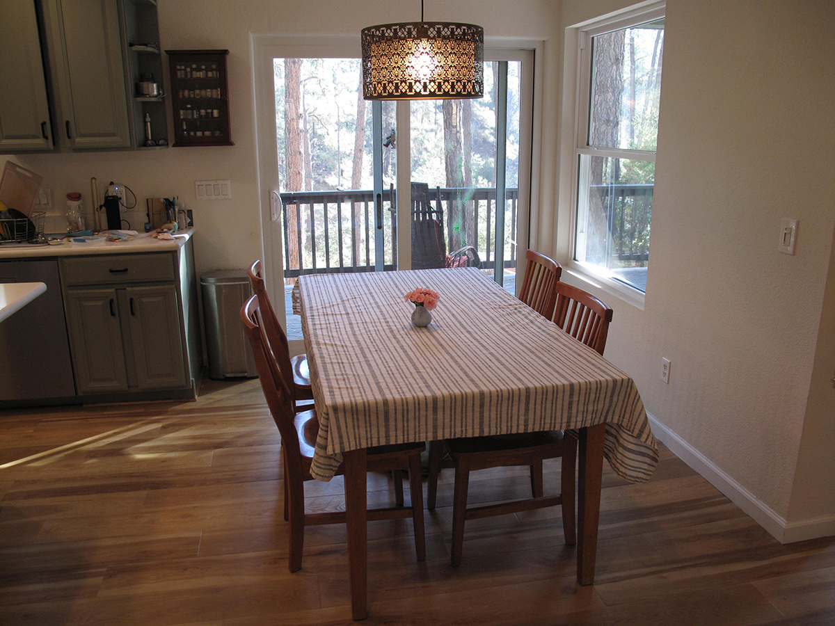
The adjacent open Dining area creates an easy social flow between the Kitchen and the Living Room. And a handy craft area keeps hands and creative minds busy at any hour of the day!
Kitchen Renewal
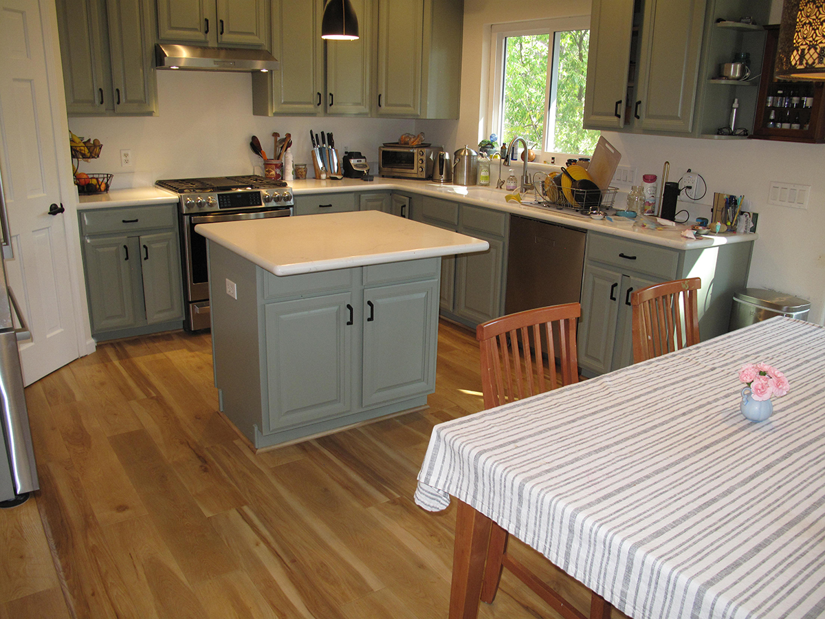
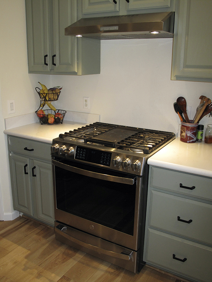
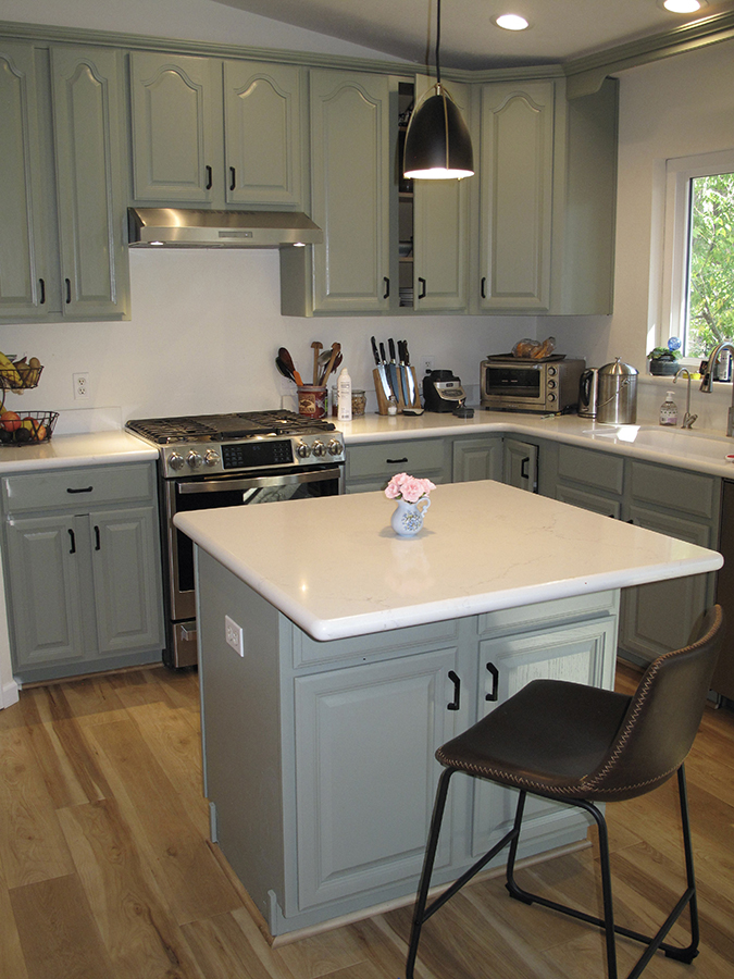
The Kitchen was upgraded with new appliances, countertops, fresh paint, and hardware. A very cool, soft green was chosen for the cabinetry.
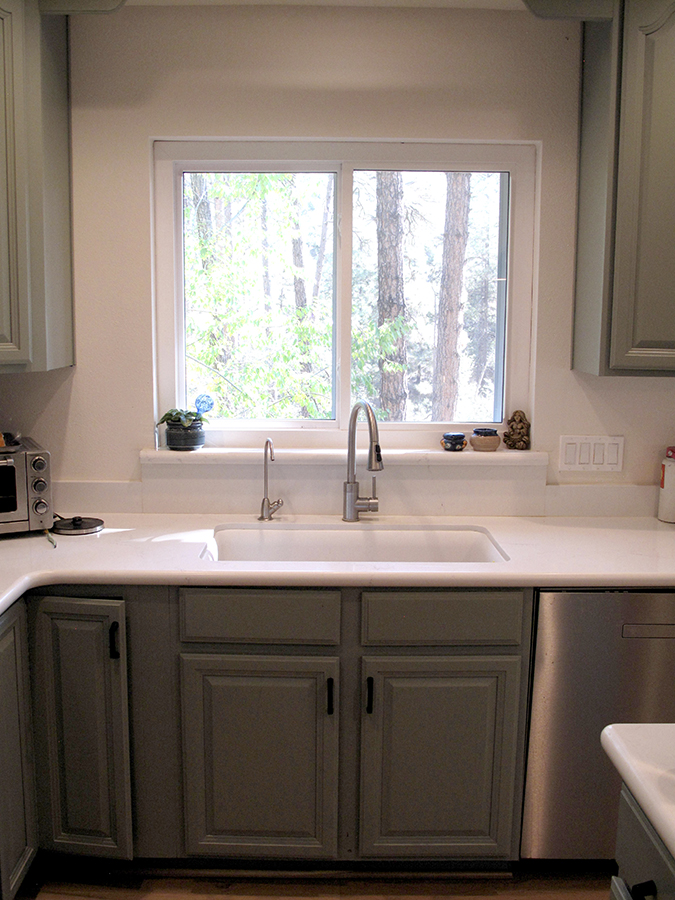
We selected a deep Kohler Durock under-mount sink and a single-hole Elkay faucet that enhanced the contemporary feel.
LOWER-LEVEL DESIGN GOALS
The pre-existing bedroom and bath felt isolated and unwelcoming.
So, it was important to:
- Bring light and sunshine into the dark, dank corners
- Improve air circulation
- Create balanced temperature control
- Bring increased vitality into the cold unfinished lower level!
With the completion of these lower-level projects, the whole house is now fully lived-in from top to bottom!
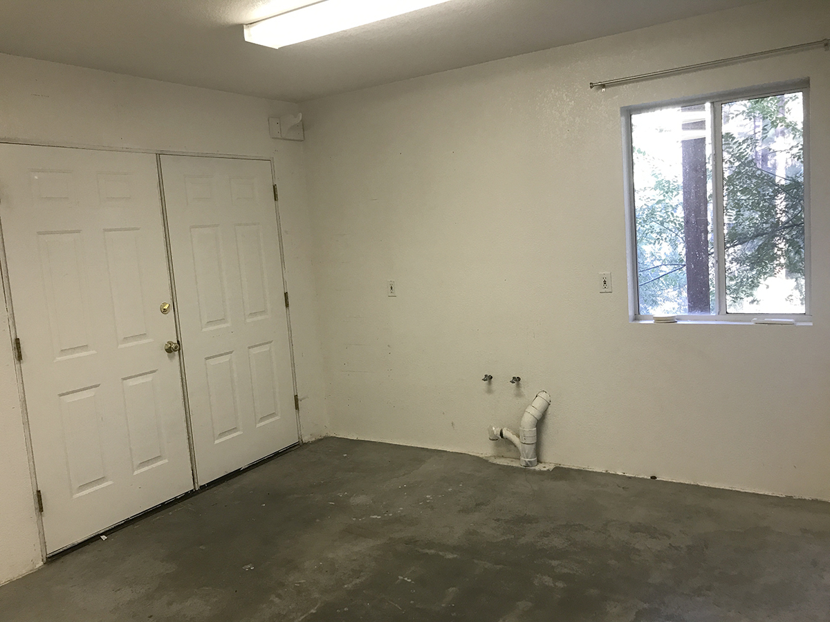
The blank palette of an unfinished basement.
Guest Suite Design
This end of the basement was originally used as a workshop/studio, this bleak cinder-blocked area had been cold and dark. It had one narrow window, harsh florescent ceiling fixtures, and a double steel door to the side yard.
The Suite was completed first. It provided the family with a comfortable living quarter while the upstairs construction progressed. Taken as a stand-alone design project, the room’s long, narrow shape presented some challenges.
Previously, when guests visited, space heaters were required. Not cozy at all! Three Daikin Mini Split Wall Units were installed. The units provide year-round comfort by mechanically cooling or heating the air from inside the home while transferring the heat absorbed or lost to the outside via a sealed refrigerant circuit.
Make Your Reservations Now!
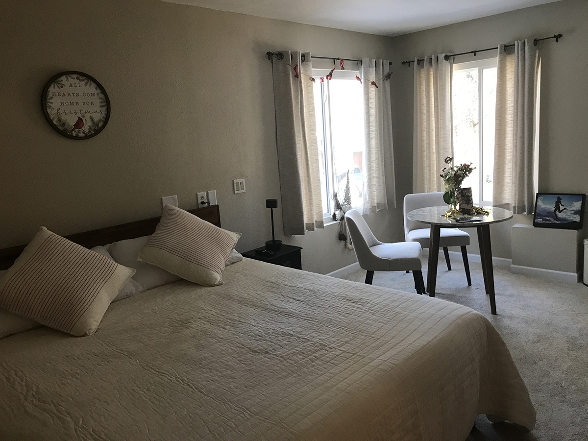
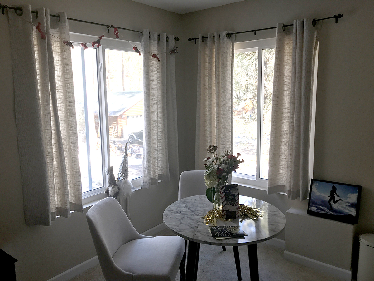
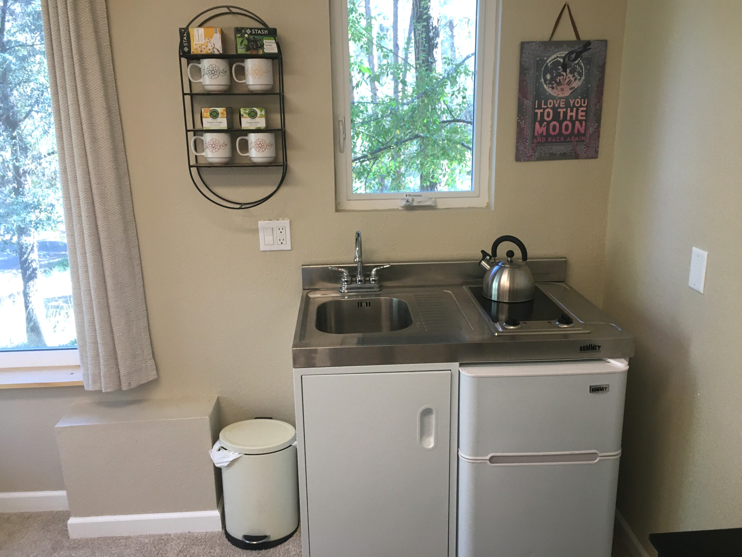
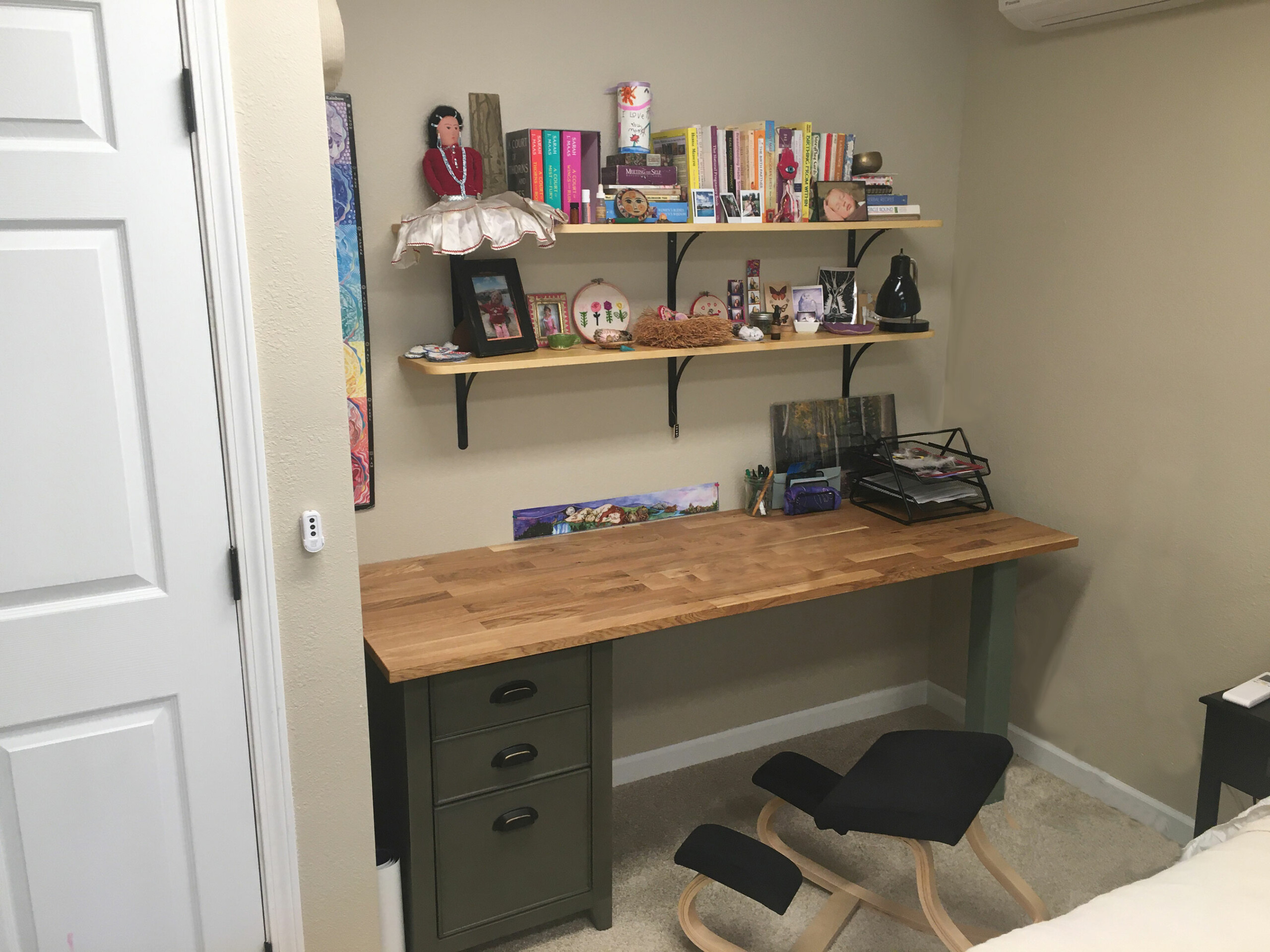
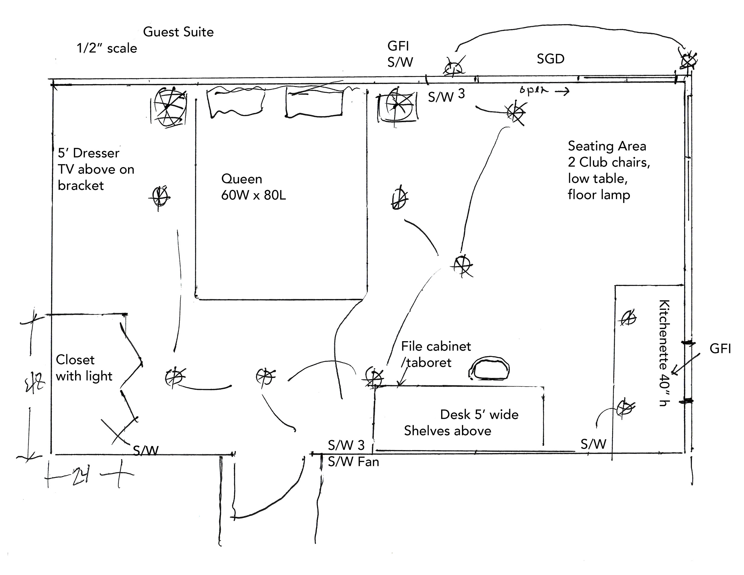
The new Guest Suite shares the pre-existing lower-level bathroom. It includes an eating/sitting area with a compact prefab kitchenette, a king-sized bed, a dresser, a large closet, and a desk area for a busy and creative entrepreneur.
I added two fairly large windows in the eastern corner. They are positioned to catch the morning sun in winter, and not be blocked by the deck above. When installing these windows, we encountered interference with existing plumbing from the Master Bath above. This issue was actually a benefit, as when we opened the ceiling, we found considerable mold that had grown from a long-standing leak. Bleach and oxygen were sufficient to fix the issue.
Incorporating all the creature comforts into a 12’x19’ space has made this room into an extra (sweet) hideaway zone.
Family Room
By installing a door from the hallway at the bottom of the stairs, we defined a much-needed Family Room. We warmed the space up with textured rustic wood paneling, fresh warm white paint in Linen, and new carpet over the existing concrete floor. With added illumination, this area is a haven for various activities including a home office, yoga space, and a playroom. All good!
WHOLE HOUSE UPGRADES – Adding continuity and style
All windows and exterior doors were replaced with energy-efficient products by Pro Via supplied by Best Window & Door Company.
I reconfigured some of the window sizes and types to conform with current egress codes and fenestration opportunities. For example, the window height over the kitchen sink was changed from 34” to 38”. The header width remained the same. This provides a pleasing view when standing at the sink. (You may know that I love a view!)
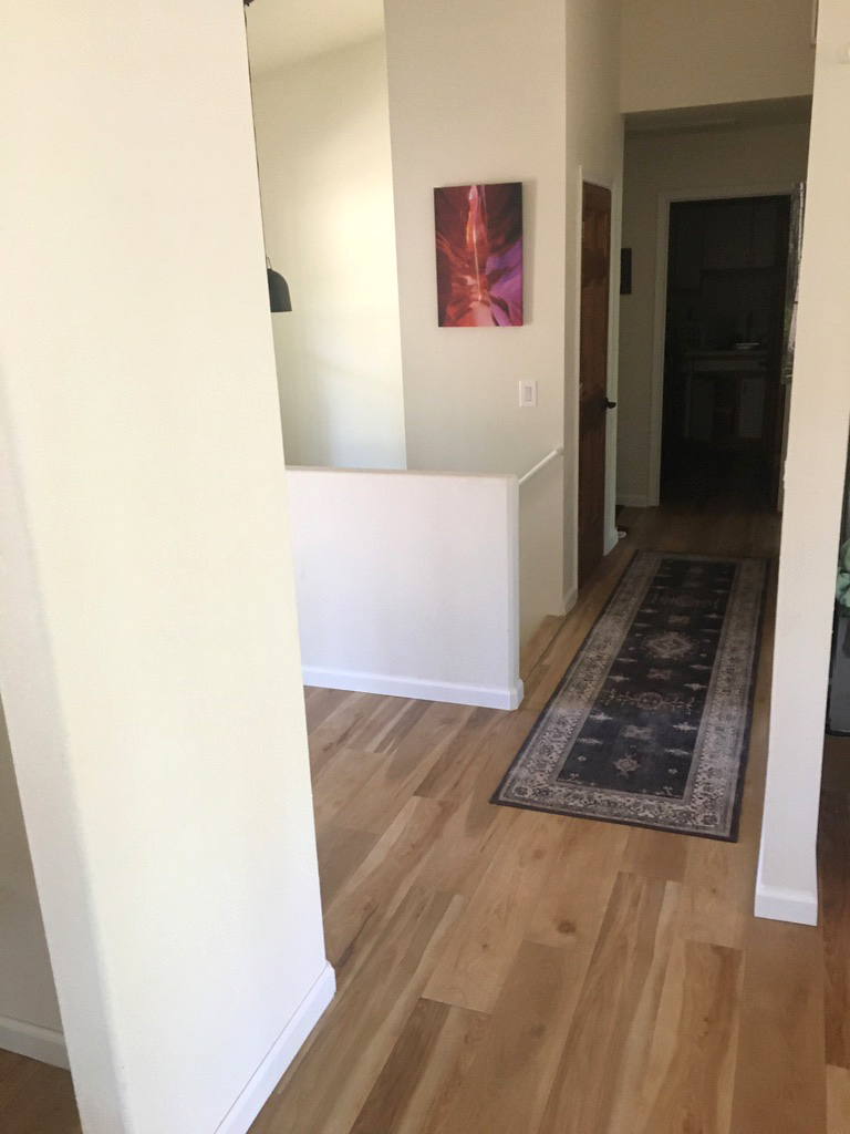
On the main level, floors and carpets were replaced with Luxury Vinyl CoreTek* plank flooring from US Floors. This product is extremely durable, water-resistant, and beautiful. The flooring brings design unity to the living area. The planks are backed with a cork substrate for a resilient feel with sound-dampening quality.
SWEAT EQUITY
The homeowners knew from the onset that labor on their part would be needed to accomplish this whole house remodel. They certainly met the challenge.
My role was to guide and differentiate the many choices and to offer steady encouragement to keep the project on track.
The homeowners sifted and purged possessions. They shifted their belongings and sleeping quarters from one floor to the other. They endured stress, noise, and dust. They painted and vacuumed and made dump runs. They coordinated contractors and tracked special orders. These tasks are the requirements of living through an owner-contracted remodeling project.
Sitting in the new Living Room looking out at the pine trees, I can feel the renewed energy signature and beauty of a space that supports Health and Happiness for this lovely family!
